Elekta ONE Design System
Elekta
In addition to a full component library, our design system includes several innovations uniquely tailored to clinical oncology.
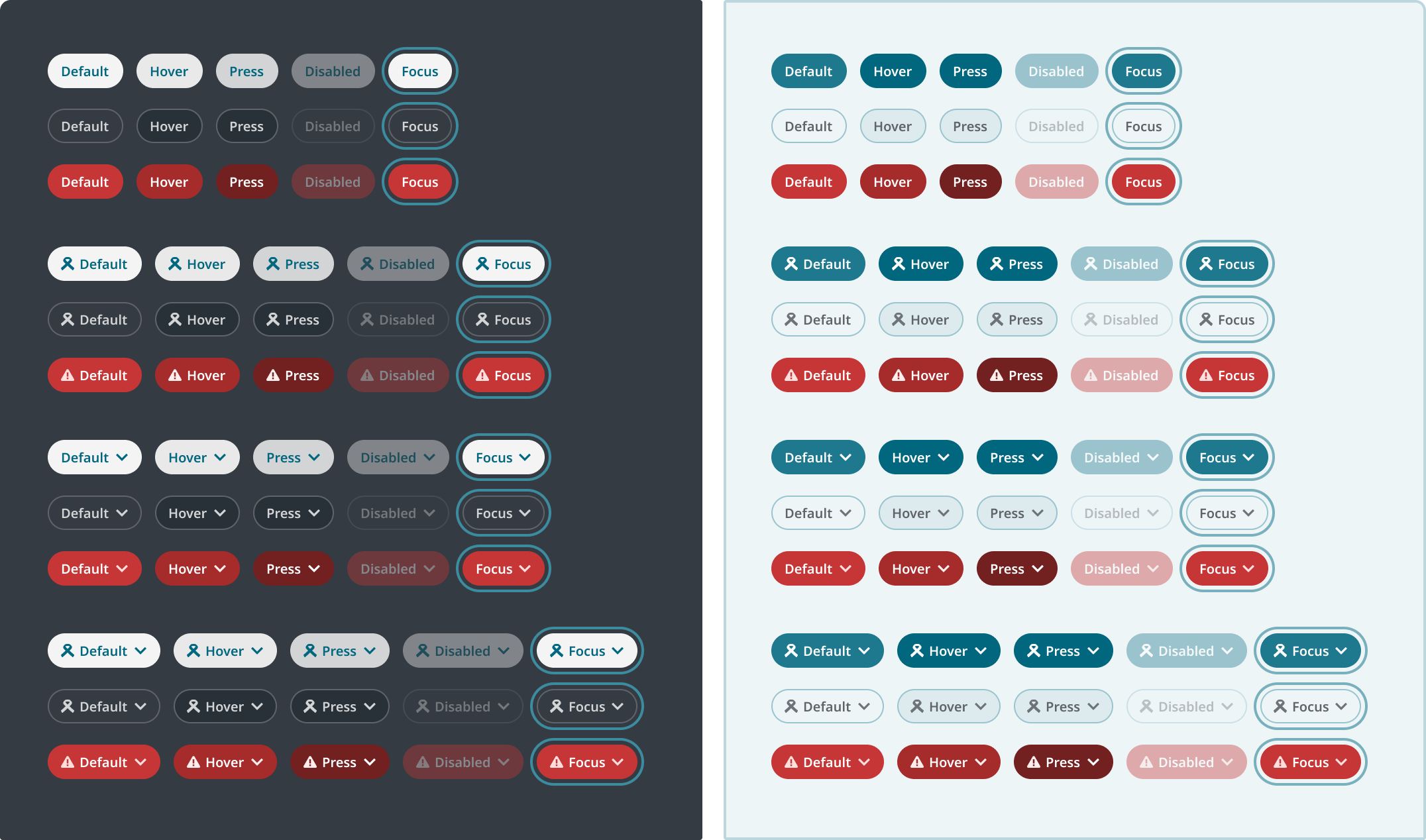
Elekta ONE design matrix
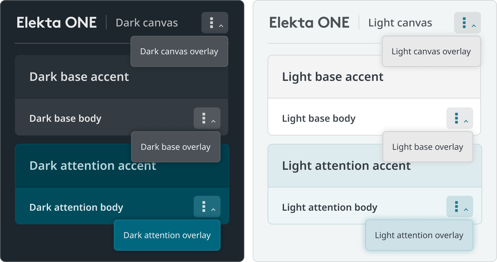
Challenge
Theme switching across our multilayered visual language can be painstaking, especially within larger projects.
Solution
We devised a system of nested token aliases within Figma, creating a fluid matrix of themes, subthemes, and subsections.
Outcome
We can quickly confidently switch between light, dark and wireframe themes knowing all elements within will appear as expected, allowing us to ideate much faster.
Interchangeable wireframes
Challenge
We needed to present our exploratory work in wireframes without hampering our designers who think in high-fidelity.
Solution
Leveraging our Figma variables matrix, we created a wireframe theme interchangeable with our high-fidelity work at the flip of a switch.
Outcome
Our conceptual explorations are no longer misconstrued as ready for development, while wireframes can be quickly converted into polished concepts for pitches and presentations.
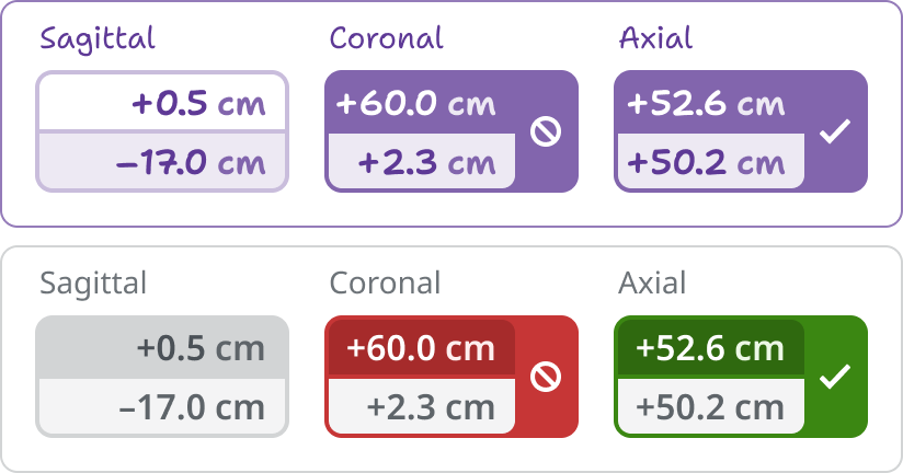
Information hierarchy
Challenge
Elekta’s applications follow dense, varied information structures making it difficult to establish common visual data patterns.
Solution
After surveying our existing applications, we created an adjustable master template of the most densely nested information scheme we could find, allowing superfluous levels to be removed as needed.
Outcome
The unified information model reduced cognitive load and further harmonized the Elekta ONE experience.
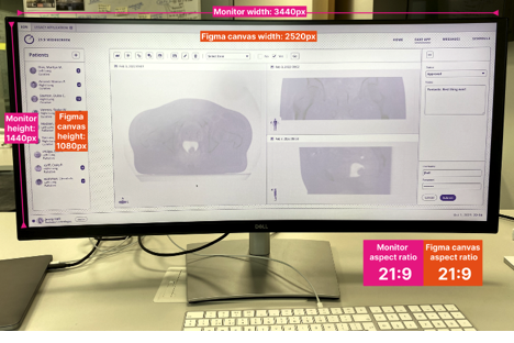
Form factors & screen sizes
Challenge
Our broad array of medical device screens are developed along varied REM scalings which Figma is unable to emulate.
Solution
We created REM-compensated Figma canvases to emulate our various screen sizes and form factors.
Outcome
We can fluidly design for varying device sizes, interaction models, and viewing distances without having to maintain an excessive library of component sizes.
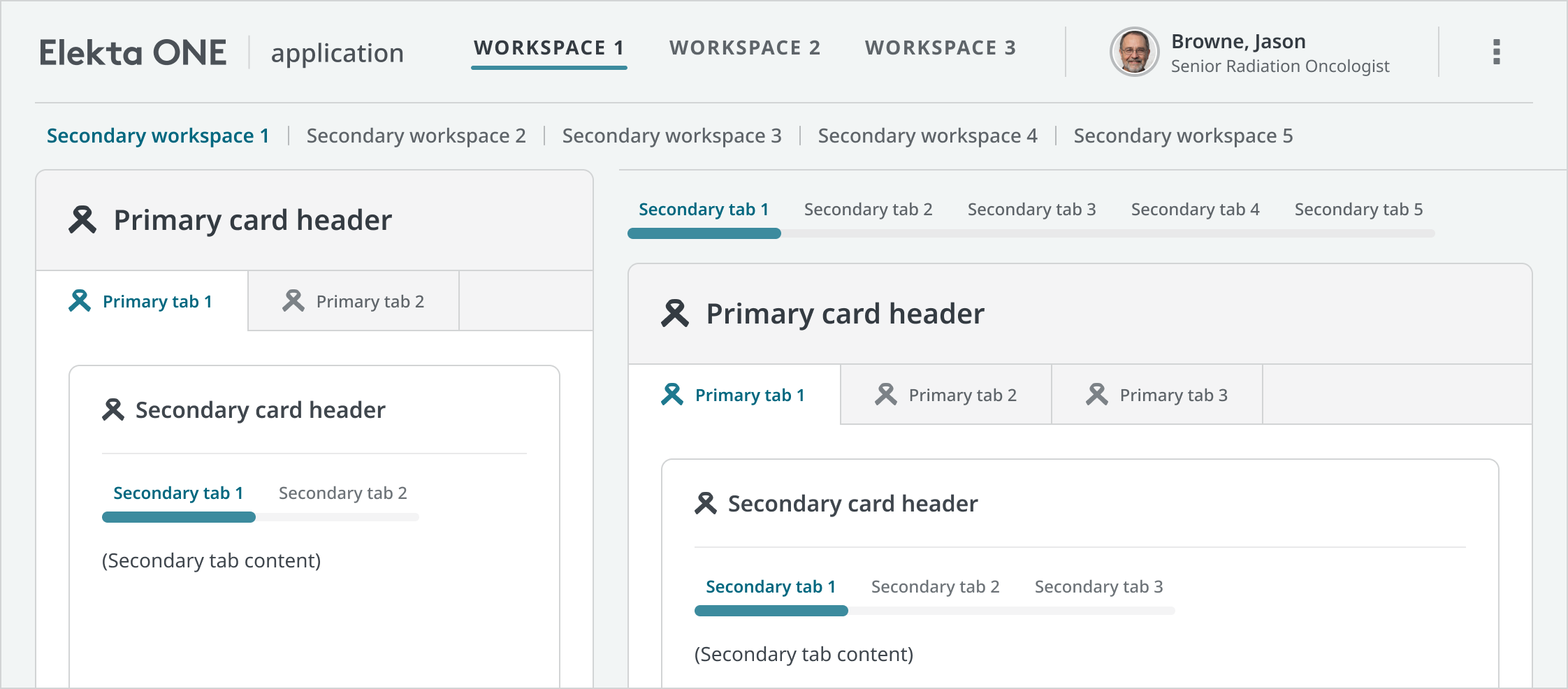
Developer handoff
Challenge
Even with Figma Dev Mode, our array of component permutations can be difficult for developers to triage.
Solution
We created a developer reference system which delineates component variants and permutations across all our themes and subsections.
Outcome
This approach sped up development and improved mutual understanding between design and code.
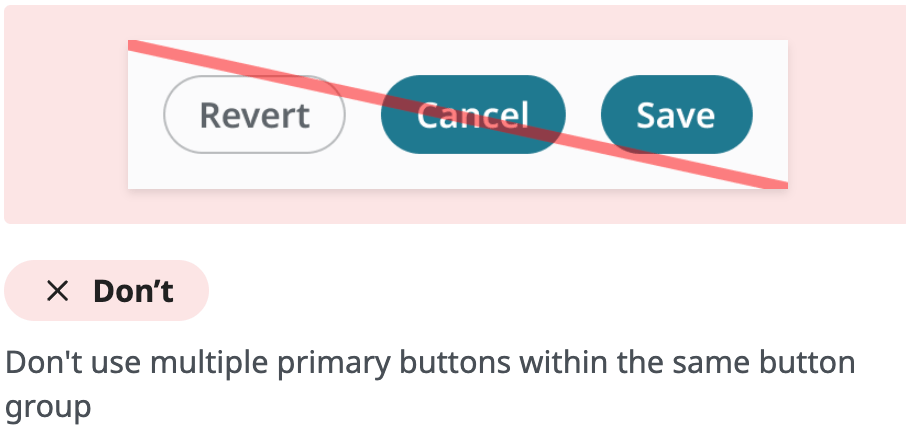
Documentation imagery
Challenge
Our documentation system was incompatible with our master file’s variables matrix, making it difficult to visually represent our design system in our guidelines.
Solution
We created a Figma to Zeroheight ‘bridge’ file containing easily updatable component instances and demonstrative illustrations.
Outcome
Our documentation images are easily maintainable even during frequent updates to our design system.
Elekta ONE Design System
Elekta
In addition to a full component library, our design system includes several innovations uniquely tailored to clinical oncology.
Elekta ONE design matrix
Challenge
Theme switching across our multilayered visual language can be painstaking, especially within larger projects.
Solution
We devised a system of nested token aliases within Figma, creating a fluid matrix of themes, subthemes, and subsections.
Outcome
We can quickly confidently switch between light, dark and wireframe themes knowing all elements within will appear as expected, allowing us to ideate much faster.
Interchangeable wireframes
Challenge
We needed to present our exploratory work in wireframes without hampering our designers who think in high-fidelity.
Solution
Leveraging our Figma variables matrix, we created a wireframe theme interchangeable with our high-fidelity work at the flip of a switch.
Outcome
Our conceptual explorations are no longer misconstrued as ready for development, while wireframes can be quickly converted into polished concepts for pitches and presentations.
Information hierarchy
Challenge
Elekta’s applications follow dense, varied information structures making it difficult to establish common visual data patterns.
Solution
After surveying our existing applications, we created an adjustable master template of the most densely nested information scheme we could find, allowing superfluous levels to be removed as needed.
Outcome
The unified information model reduced cognitive load and further harmonized the Elekta ONE experience.
Form factors & screen sizes
Challenge
Our broad array of medical device screens are developed along varied REM scalings which Figma is unable to emulate.
Solution
We created REM-compensated Figma canvases to emulate our various screen sizes and form factors.
Outcome
We can fluidly design for varying device sizes, interaction models, and viewing distances without having to maintain an excessive library of component sizes.
Developer handoff
Challenge
Even with Figma Dev Mode, our array of component permutations can be difficult for developers to triage.
Solution
We created a developer reference system which delineates component variants and permutations across all our themes and subsections.
Outcome
This approach sped up development and improved mutual understanding between design and code.
Documentation imagery
Challenge
Our documentation system was incompatible with our master file’s variables matrix, making it difficult to visually represent our design system in our guidelines.
Solution
We created a Figma to Zeroheight ‘bridge’ file containing easily updatable component instances and demonstrative illustrations.
Outcome
Our documentation images are easily maintainable even during frequent updates to our design system.
Elekta ONE Design System
Elekta
In addition to a full component library, our design system includes several innovations uniquely tailored to clinical oncology.
Elekta ONE design matrix
Challenge
Theme switching across our multilayered visual language can be painstaking, especially within larger projects.
Solution
We devised a system of nested token aliases within Figma, creating a fluid matrix of themes, subthemes, and subsections.
Outcome
We iterate and prototype more efficiently, confident that all elements within our complex visual hierarchy will render properly everywhere.
Interchangeable wireframes
Challenge
We needed to present our exploratory work in wireframes without hampering our designers who think in high-fidelity.
Solution
Leveraging our Figma variables matrix, we created a wireframe theme interchangeable with our high-fidelity work at the flip of a switch.
Outcome
Our conceptual explorations are no longer misconstrued as ready for development, while wireframes can be quickly converted into polished concepts for pitches and presentations.
Information hierarchy
Challenge
Elekta’s applications follow dense, varied information structures making it difficult to establish common visual data patterns.
Solution
After surveying our existing applications, we created an adjustable master template of the most densely nested information scheme we could find, allowing superfluous levels to be removed as needed.
Outcome
The unified information model reduced cognitive load and further harmonized the Elekta ONE experience.
Form factors & screen sizes
Challenge
Our broad array of medical device screens are developed along varied REM scalings which Figma is unable to emulate.
Solution
We created REM-compensated Figma canvases to emulate our various screen sizes and form factors.
Outcome
We can fluidly design for varying device sizes, interaction models, and viewing distances without having to maintain an excessive library of component sizes.
Developer handoff
Challenge
Even with Figma Dev Mode, our array of component permutations can be difficult for developers to triage.
Solution
We created a developer reference system which delineates component variants and permutations across all our themes and subsections.
Outcome
This approach sped up development and improved mutual understanding between design and code.
Documentation imagery
Challenge
Our documentation system was incompatible with our master file’s variables matrix, making it difficult to visually represent our design system in our guidelines.
Solution
We created a Figma to Zeroheight ‘bridge’ file containing easily updatable component instances and demonstrative illustrations.
Outcome
Our documentation images are easily maintainable even during frequent updates to our design system.